# Dropdown component
# Code examples
# Basic example
# Separation
A dropdown button can be divided into left and right parts. The left part consists of icons and text, and the right part is a drop-down arrow. When the separate parameter is set to false, you can click any one of the two parts to display the drop-down list. When the separate parameter is set to true, you can only click the right part (drop-down arrow) to display the drop-down list.
In the following demo, you will see two dropdown buttons as shown below:
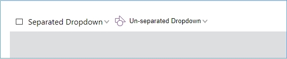
Try to click the 'Separated Dropdown' button, you will notice the dropdown list can display only when the arrow is clicked. This is because the dropdown button has been separated, and only clicking-on-arrow can trigger the dropdown list. But you can make the dropdown list display by clicking any area on the Un-separated Dropdown button.
# Use as select component
# Editable
# Position the dropdown list
# Dynamic dropdown list
# API
# Dropdown component template
Template example:
<dropdown text="" icon-class="" editable align="left" valign="bottom" separate="true" selected="0"></dropdown>
The template properties:
| Property | Description | Type | Default Value | Version |
|---|---|---|---|---|
| text | Set text for dropdown button | string | '' | 7.0 |
| icon-class | Set the icon's css class | string | '' | 7.0 |
| editable | If editable | boolean | false | 7.0 |
| align | Horizontal alignment | 'left'|'right'|'out-right'|'out-left'|'center'|'client-center' | 'left' | 7.0 |
| valign | Vertical alignment | 'top'|'bottom'|'center'|'client-center' | 'bottom' | 7.0 |
| separate | If the dropdown button is separated | boolean | true | 7.0 |
# Configure dropdown properties using fragment
Besides the editOptions, the others are same as the template properties.
{
    target: 'dropdown-name',
    config: {
        editOptions: {
            type: 'text',
            min: 0,
            max: 0,
            step: 0,
            vallue: ''
        }
    }
}
| Property | Description | Type | Default Value | Version |
|---|---|---|---|---|
| editOptions.type | Set edit mode for dropdown. It supports both the 'text' and 'number' edit mode | string | 'text' | 7.0 |
| editOptions.min | The minimum value for the edit box. It is valid only when the edit mode is 'number' | number | 7.0 | |
| editOptions.max | The maximum value for the edit box. It is valid only when the edit mode is 'number' | number | 7.0 | |
| editOptions.step | The step for the edit box. It is valid only when the edit mode is 'number' | number | 7.0 | |
| editOptions.value | The initial value of the edit box | string|number | 7.0 |
# Dropdown object properties
| Property | Description | Type |
|---|---|---|
| disabled | Dropdown disabled status | boolean |
| isVisible | Dropdown visible status | boolean |
| isActive | Check if the dropdown list is active | boolean |
# Methods
| Method | Description | Version |
|---|---|---|
setEditValue(text:String|number): void | Set the input value. This won't trigger the changeevent | 7.0 |
disable(): void | Disable dropdown. | 7.0 |
enable(): void | Enable the disabled dropdown | 7.0 |
show(): void | Show the hidden dropdown | 7.0 |
hide(): void | Hide the dropdown | 7.0 |
active(): void | Open the dropdown | 7.0 |
deactive(): void | Close the dropdown | 7.0 |
destroy(): void | Destroy the component | 7.0 |
# Events
| Name | Description | Example | Version |
|---|---|---|---|
| active | Triggered upon the dropdown expands | dropdown.on('active', () => {}) | 7.0 |
| deactive | Triggered upon the dropdown hides | dropdown.on('deactive', () => {}) | 7.0 |
| change | Triggered upon the mouse enters and focus loses | dropdown.on('change', (newValue,oldValue) => {}) | 7.0 |